
Color theory can be super helpful to know for acrylic painting. According to the Interaction Design Foundation, color theory is the study of how colors work together and how they affect our emotions and perceptions. When creating art, it’s helpful to know how different colors work together and the message our piece is giving off.
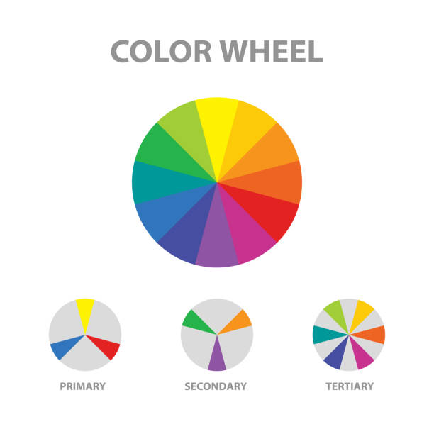
The Color Wheel
The color wheel is an abstract illustration used to help us define colors and their relationships with one another. The color wheel includes the primary, secondary, and tertiary colors.
Primary Colors: Red, Blue, & Yellow
Primary colors are the foundation of the color wheel. The 3 primary colors cannot be created by mixing other colors together. However, you can mix the primary colors to create other colors. You can make different shades of red, blue, or yellow, such as by adding white to lighten, but you cannot create true red, blue, or yellow by mixing any other colors.
Secondary Colors: Violet, Orange, & Green
Secondary colors are created by mixing equal portions of 2 primary colors together. Mixing red and blue creates violet; mixing red and yellow creates orange; and mixing blue and yellow creates green.
Tertiary Colors: Red-Violet, Blue-Violet, Blue-Green, Yellow-Green, Yellow-Orange, & Red-Orange
Tertiary colors are created by mixing equal portions of a primary and a secondary color. There are 6 tertiary colors. The needed colors to create the tertiary colors are in the names, but I also listed the combinations below.
- Red (primary) + Violet (secondary) = Red-Violet
- Blue (primary) + Violet (secondary) = Blue-Violet
- Blue (primary) + Green (secondary) = Blue-Green
- Yellow (primary) + Green (secondary) = Yellow-Green
- Yellow (primary) + Orange (secondary) = Yellow-Orange
- Red (primary) + Orange (secondary) = Red-Orange
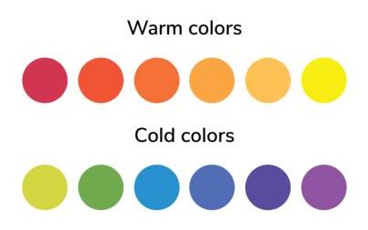
Complimentary Colors
Complimentary colors are two colors that are directly across from one another on the color wheel. These pairing are usually bold, but they tend to compliment each other well. Below I have included a picture of one of my paintings that I created. For this painting, I roughly payed attention to the complimentary colors. Violet and yellow are directly across from one another on the color wheel, and you can see that I used that as one of my color combinations in this painting.
I really love this painting. All of the colors compliment each other.