
Introduction
As the awards season concludes with the Oscars on March 15th, I decided it would be fun to rank the 2026 Oscars’ best picture nominees with a twist. I wanted to rank the best picture nominees based on their posters.
This ranking is solely subjective based on my personal preferences of the poster designs.
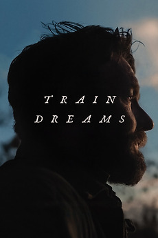
10. Train Dreams
Train Dreams is a visually stunning film in its cinematography and its melancholy atmosphere. The usage of only natural lighting within the film is an incredible feat in itself. However, the poster itself feels lackluster compared to its competitors in its simplicity of a side profile silhouette.
9. One Battle After Another
While I love the vintage- 80s artwork vibe of the poster, the poster has a little too much going on in its composition. The larger-than-life head of DiCaprio is a little comical, hanging on the horizon. I believe that the composition of the poster could be improved if the poster didn’t fall into what I would consider the “floating heads” trope.
Learn more about floating head posters from my blog post!
https://buzz.uni.edu/cinegraphics/floating-head-posters/

8. F1
The film F1 has been the topic of a lot of conversation during this awards season, especially with its surprise nomination as a best picture contender.
The F1 poster is inoffensive and doesn’t fall into the typical floating heads trope of big blockbuster films. Its neutral greyscale color palette is sleek, clean, and fits with the coolness of Pitt’s Sonny Hayes character. It’s nicely composed and straightforward, allowing audiences a sense of what they are going to see.
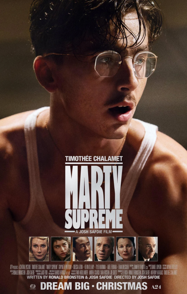
7. Marty Supreme
The Marty Supreme poster is eye-catching. The dramatic light falling onto Chalamet’s title character offers a strong sense of contrast. The sweat and pose that Chalamet’s character portrays in this poster fit well within the high stakes and stress that the film presents to its main character. The thing that takes away some points from my ranking is the character profiles situated at the bottom of the poster. In a way, it stands out to me as a more “refined” take on the floating head posters. They highlight the incredibly star-studded cast, but don’t add anything to the poster, rather than to highlight the diverse cast of actors.
6. Sinners
The most vibrant and saturated poster on this list, the Sinners poster, stands out. Again Micheal B. Jordan’s character is placed nicely in the center of the poster initially drawing the main focus. It’s a classic action hero stance and poster. The warm hues of the setting sun and the background give a sense of the dangerous “wild west” setting of the film. The shadowy figures that haunt Jordan’s character in the back elevate the film’s sense of conflict and danger.
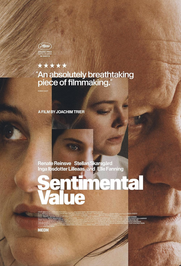
5. Sentimental Value
I would say that the Sentimental Value poster is an example of how to do a “floating head” poster correctly. Whether it is a floating head poster or not doesn’t take away from the genius composition of the poster. Within the context of the film, this amalgamation poster fits exactly with the theme of generational trauma and how it bonds families together.
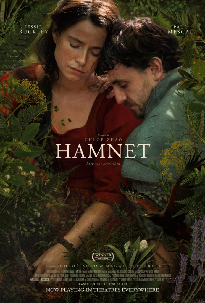
4. Hamnet
The lushness of foliage wrapping around Buckley and Mescal adds an etherealness to the poster. It’s such a classic drama poster; the pain and connection between the two characters are completely evident in this poster. The use of color and palette complements the green of the foliage with the deep red of Buckley’s dress, and it has a great pull of focus on the main character of the story. The poster sets the tone for the film as a down-to-earth, tragic drama.
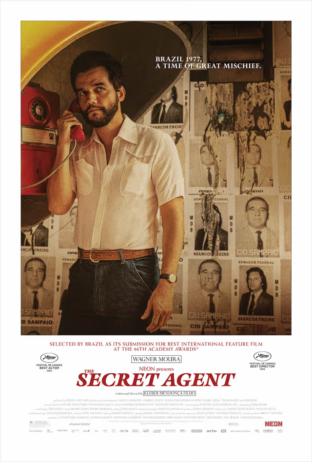
3. The Secret Agent
The Secret Agent film poster is a classic film poster that brings intrigue and mystery to audiences. What really makes this poster stand out to me is the political campaign posters surrounding Moura’s character. It’s eye-catching, and it’s vintage, grainy 70s look fits well within the time period the movie takes place.
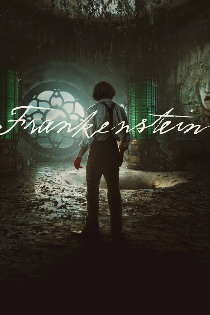
2. Frankenstein
Guillermo Del Toro’s Frankenstein‘s poster is, to no ones suprise, visually stunning and as intricate as his films. The poster is able to capture the essence of Del Toro’s artfully crafted world in his interpretation of Mary Shelly’s novel. It’s dark, and the orante setting is on full display. The palette of the poster is cool, mainly focusing on shades of green. This palette is often associated with the character of Frankenstein’s monster as commonly displayed in media.
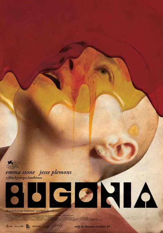
1. Bugonia
The first time I saw the poster for Bugonia, I was captivated. It’s strange, it’s jarring, and it’s certainly eye-catching. It brings a sense of dread to the viewer and leaves them with more questions about the film than answers. Stone’s character is almost in a trance, blankly staring up at an unknown subject. Its use of primary colors is stark, offering most of the color on the film’s poster to the dripping mix of red blood and yellow honey. Its visual direction stands out among the other Best Picture nominees, and that’s why it’s my favorite Best Picture Nom. poster.