

Wes Anderson is an American director who has created films for decades, with his debut film Bottle Rocket released in 1996. His films stand out from the rest, with his quirky directing and filmmaking styles, such as his use of framing. His over-the-top production design is praised by many for its intricacy and for its meticulous attention to detail. However, I believe that one of the most important factors in Anderson’s filmmaking is his usage and selection of color in his films. But ultimately, how does color in Wes Anderson’s films help create his whimsical worlds, and how does it make his films have a specific “look”?
Color of the 1970s
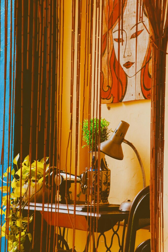
The prominence of warmth that radiates from Anderson’s films isn’t just because of its lovable, quirky characters. Color in Wes Anderson’s films heavily features sets with warm tones. These tones are reminiscent of the interior design styles of the 1970s. The nostalgic atmosphere of his films are due to his usage of common color palettes of the 1970s. Warm greens, yellows, burnt oranges, and browns were staples in 1970s design. Anderson’s films adopt these palettes in his films, and make them his own by also including cool colors to maximise contrast. The colors that he selects are often muted with a sun-faded look.
60-30-10 Rule
Wes Anderson’s set designs and costume designs work in tandem to create harmonious but colorful worlds. He balances his color scheme by following the 60/30/10 rule of interior design. The 60/30/10 rule states that to create a harmonious design, you want 60% of the scene to be a neutral foundation color, 30% of the scene to be a different color that helps add depth, while 10% of the scene to be an accent color to make an element of the scene pop. Anderson takes his neutral warm palette and applies it to this rule and often adds a highly saturated color outside of his palette, making his scenes pop. In the film The Life Aquatic With Steve Zissou, Steve wears a bright red stocking hat that contrasts with the more muted, cool-toned set of the film.
Color Psychology
Design utilizes color to subconsiously create perceptions and emotions toward an image. Some of the most common examples of how we assign connotations to colors are with the color red. The color red is associated with aggression and anger, whereas blue can be associated with peace and calm because of the connotation people have with it to water. Anderson utilizes color psychology when selecting his color palettes for his set designs. His usage of bright colors makes his usage of unsaturated and dull colors stand out that much more.

In The Royal Tenenbaums, there is a scene where Richie Tenenbaum is going through a mental breakdown. The setting is a stark contrast to the rest of the warm, colorful sets within the film. The overwhelming usage of shades of blue alerts the audience that something is wrong. This scene almost seems out of place in the film because of the switch from warm, muted sets to a set dominated by cool, vibrant tones. The visuals of the scene, along with the soundtrack, serve to create a melancholy atmosphere. Despite Anderson breaking his own rules, this scene doesn’t feel out of place in Anderson’s filmography. Together, this contrast of the scene to the rest of the film serves as a climactic moment for Richie. Anderson also uses color to demonstrate emotion in his film the Isle of the Dogs
Color in Wes Anderson Films: Isle of the Dogs
Anderson’s film Isle of the Dogs also serves as a contrast in his filmography because of the dull, unsaturated setting of the film. The film primarily takes place on an island where dogs have been banished because of a canine influenza epidemic. This island is full of trash, and the normal, colorful atmosphere of Anderson’s films is absent from this desolate island of greys, pale browns, and yellows. However, not all landscapes in this film are void of color.
The city of Megasaki City, where the humans reside, however, has the typical vibrancy and color-heavy design that is common in Anderson’s filmography. His usage of bright reds and dark purples contrasts with the almost colorless environment of the Isle of the Dogs. The bland environment sets a tone of hopelessness and depression. The grey hues mirror the sickly disease that banished the dogs to the isle in the first place. Because of this, it makes the color palette a living and organic piece of the setting itself.
Color in Wes Anderson’s Films: Conclusion
Anderson’s films are famous for his unique style, and a large part of his filmography style is his usage of color. Why color in Wes Anderson’s films are so interesting is because they follow the rules of color scheme design. His films are rooted in color psychology to create immersive worlds. Color is a design element that can be easily overlooked. The usage of color can be extremely effective in connecting audiences and drawn to your creations.
Sources
Edwards, Dunn. “1970s–2010s Popular Color Palettes by Decade.” Dunn Edwards Paints, 13 Aug. 2025, www.dunnedwards.com/pros/blog/1970s-2010s-popular-color-palettes.
Hellerman, Jason. “How Wes Anderson Uses the ‘3 Color Rule’ to Master the Palate | No Film School.” NoFilmSchool, 27 Jan. 2026, nofilmschool.com/wes-anderson-color-palatte.
Namehavar, Hassan. “The Ultimate Guide to Wes Anderson’s Color Palette: Iconic Hues & Film Breakdown.” Pixflow Blog, 5 Jan. 2026, pixflow.net/blog/the-ultimate-guide-to-wes-andersons-color-palette/.
“Wes Anderson.” Wikipedia, Wikimedia Foundation, 7 Feb. 2026, en.wikipedia.org/wiki/Wes_Anderson.