
Hey everyone! As a college student diving into the world of graphic design, I’ve realized that understanding visual hierarchy is a game-changer for creating effective designs. Whether you’re crafting a poster, designing a website, or just tinkering with some personal projects, mastering visual hierarchy can make all the difference in how your audience interacts with your work. Let’s break down what visual hierarchy is and how you can use it to enhance your designs.
What is Visual Hierarchy?
At its core, visual hierarchy is about arranging design elements according to their importance. Think of it as a roadmap for your viewers, guiding them on what to focus on first. If you’ve ever looked at a design that felt overwhelming or confusing, chances are it lacked a clear visual hierarchy. Your goal is to make your designs as clear and engaging as possible—because if your audience is confused, they’re likely to click away just as quickly as they clicked in.
The Key Principles of Visual Hierarchy
Here are three essential principles you should keep in mind when working on your designs:
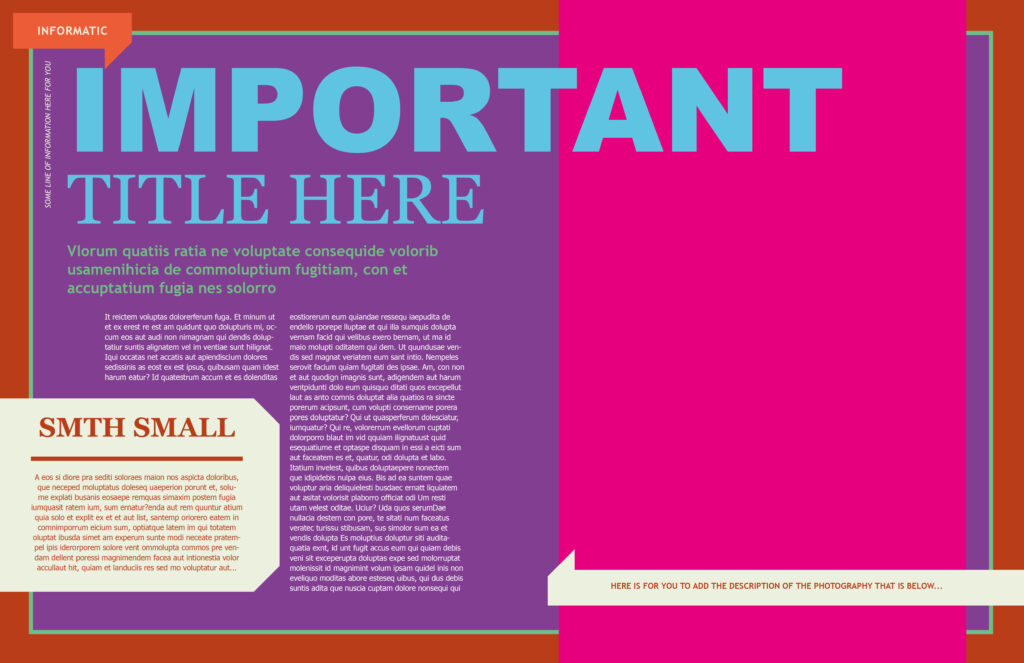
1. Size Matters
The size of your elements plays a huge role in determining what grabs attention first. Larger elements naturally draw the viewer’s eye, making them seem more important. For example, if you’re designing a flyer, you might want the headline to be significantly larger than the body text. This way, the viewer knows immediately what the main message is. So remember, if you want something to stand out, make it bigger!
2. Color is Your Best Friend
Color can have a massive impact on visual hierarchy. Bright and vibrant colors attract attention more than dull, desaturated ones. If you want a particular element to pop, consider using a bold color that contrasts with the rest of your design. However, use color wisely—too many bright colors can create chaos. Aim for a cohesive palette that still allows key elements to shine.
3. Embrace Blank Space
Also known as “white space,” blank space can be your secret weapon in design. When an element is surrounded by blank space, it stands out even more. It gives the viewer’s eyes a break and helps them focus on what’s important. Don’t be afraid to leave areas empty; it can make your design feel more elegant and organized. Think of it as giving your design room to breathe!
Putting It All Together
Now that you know the basics, it’s time to see how these principles work in practice. Try experimenting with different layouts and see how adjusting size, color, and blank space changes the feel of your design. You can even look at designs you admire and analyze how they use visual hierarchy. This can give you inspiration and help reinforce what you’ve learned.
Final Thoughts
Visual hierarchy is crucial for creating clear, effective designs that capture your audience’s attention. By understanding and applying size, color, and blank space, you can guide viewers through your work and ensure they get the message you want to convey.
Did you find these tips helpful? What are your thoughts on visual hierarchy? Feel free to share your experiences or questions in the comments!
Leave a Reply