

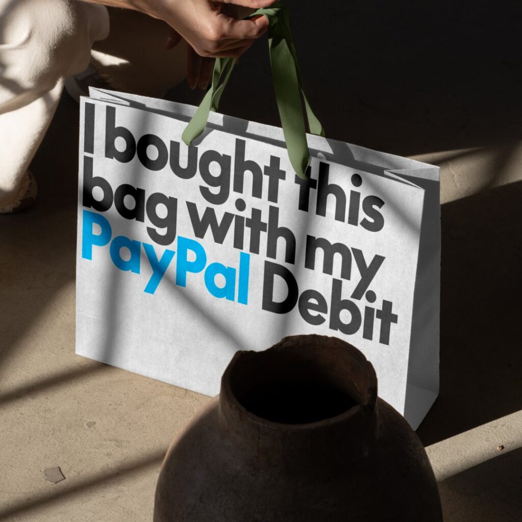
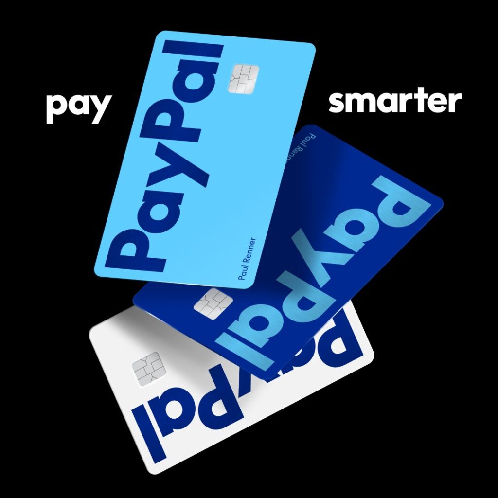
When PayPal released their new logo design in September 2024, it sparked a whirlwind of reactions from graphic designers, marketers, and anyone familiar with the brand’s iconic look.
While some appreciate the simplicity of the rebrand and the sleek animations accompanying the mobile app, others criticize it as “soulless, unimaginative, boring, and indistinguishable from other brands.” The logo has certainly made waves online, with countless tweets and posts sharing diverse opinions on the redesign.
From a graphic design perspective, the trend of brands opting for over-simplified, “safe” designs that prioritize sales can be disheartening. For creative individuals, it may feel like our skills are being overlooked when brands shy away from adding personality and flair to their logos. We recognize the immense potential in branding and logo design, so seeing examples like PayPal’s rebrand can make it seem like everything is becoming so mainstream that imagination and creativity are no longer valued.
The rapid evolution of the digital space is set to drastically alter the future of graphic design, especially with the rise of advanced AI technologies. These advancements could lead to more abstraction and simplification in fonts, logos, websites, and various graphics, particularly for corporate and big-name companies.
What are your thoughts on the new PayPal logo? Do you agree or disagree with the current direction of graphic design? What are your favorite graphic design trends?
Leave a Reply