If you’re a midwesterner, you’ve potentially heard about the store RAYGUN. Let’s break down their origin, visual brand identity, and how their charm has brought them success.
Origins
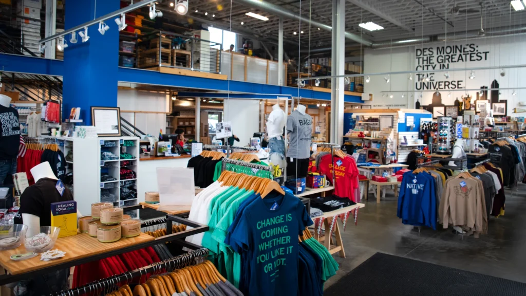
RAYGUN, founded by Mike Draper in 2005, started as a small t-shirt business in Des Moines, Iowa, and has since grown into a regional retail chain that celebrates Midwestern culture with humor and bold messaging. The brand’s visual design identity centers around simple, text-heavy graphics on products like t-shirts, posters, mugs, and other lifestyle merchandise. Many of these designs carry witty, hyper-local slogans and socially conscious messages, reflecting both Midwestern charm and progressive values.
Visual Identity
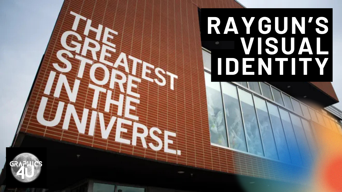
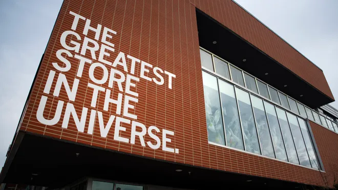
Typography-Focused Design: RAYGUN’s products emphasize minimal graphics and large, bold text as the primary visual element. The typography is often sans-serif, emphasizing clarity and impact. This straightforward approach allows the humor or message to take center stage, ensuring that the words themselves become the most important design component.
Color Palette: The brand’s merchandise often uses primary colors (reds, blues, yellows) as backdrops, with text in contrasting black or white. This simple color scheme enhances the legibility and playful tone of the slogans.
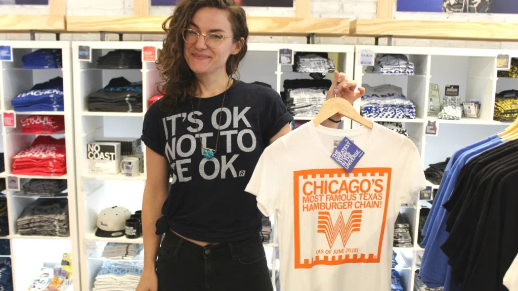
Local and Topical Themes: RAYGUN’s designs reflect both local pride and contemporary social issues. Some slogans might highlight love for Iowa or Chicago, while others address political topics like feminism, LGBTQ+ rights, and environmentalism. The company frequently updates its product lines to stay relevant.
Product Evolution & Social Responsibility
Initially focused on screen-printed t-shirts, RAYGUN has expanded into posters, stickers, drinkware, and other products. The common thread across these items is their ease of use—designs are meant to spark a quick emotional response, whether it be laughter or a sense of solidarity with a cause.
RAYGUN sets itself apart not just through design but also through its business model. It operates as one of the largest unionized clothing retailers in the U.S., reflecting a commitment to fair labor practices. This ethos aligns with the progressive messaging found in its products, creating a coherent brand identity where design and business values intersect.
Additionally, RAYGUN donates 15-30% of its profits to community organizations and initiatives. This integration of activism into both product design and business operations makes the brand an excellent case study in socially conscious design.
Takeaways for Designers & Brand Strategists
Design with a Strong Voice: RAYGUN’s success shows the power of designs with a distinct and recognizable voice, especially in a crowded retail market.
Leverage Local and Topical Themes: Focusing on regional identity and timely issues helps create a sense of belonging among customers.
Integrate Social Impact with Design: RAYGUN’s unionized structure and community donations enhance its authenticity and strengthen customer loyalty, proving that business practices and design can align seamlessly.
RAYGUN’s ability to combine humor, typography, and social impact into a cohesive brand identity makes it a prime example of effective and engaging design in retail. The company’s success demonstrates how thoughtful design can do more than sell products—it can foster community pride and contribute to social change.
Leave a Reply