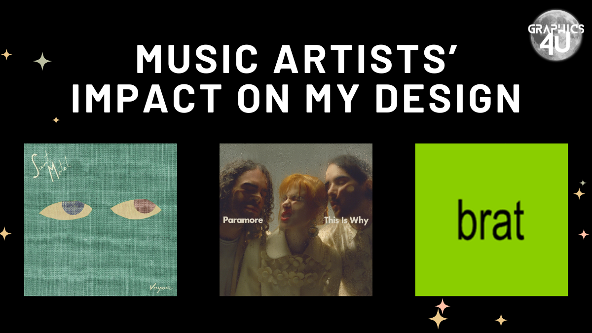
Music and album art is a huge driver of my design inspiration, especially with the wide variety of aesthetics different musical artists have these days. Quality typography and meaningful colors are things I love to see in an album. This blog post is a more personal one as I share some of my favorite merch/musical artist designs.
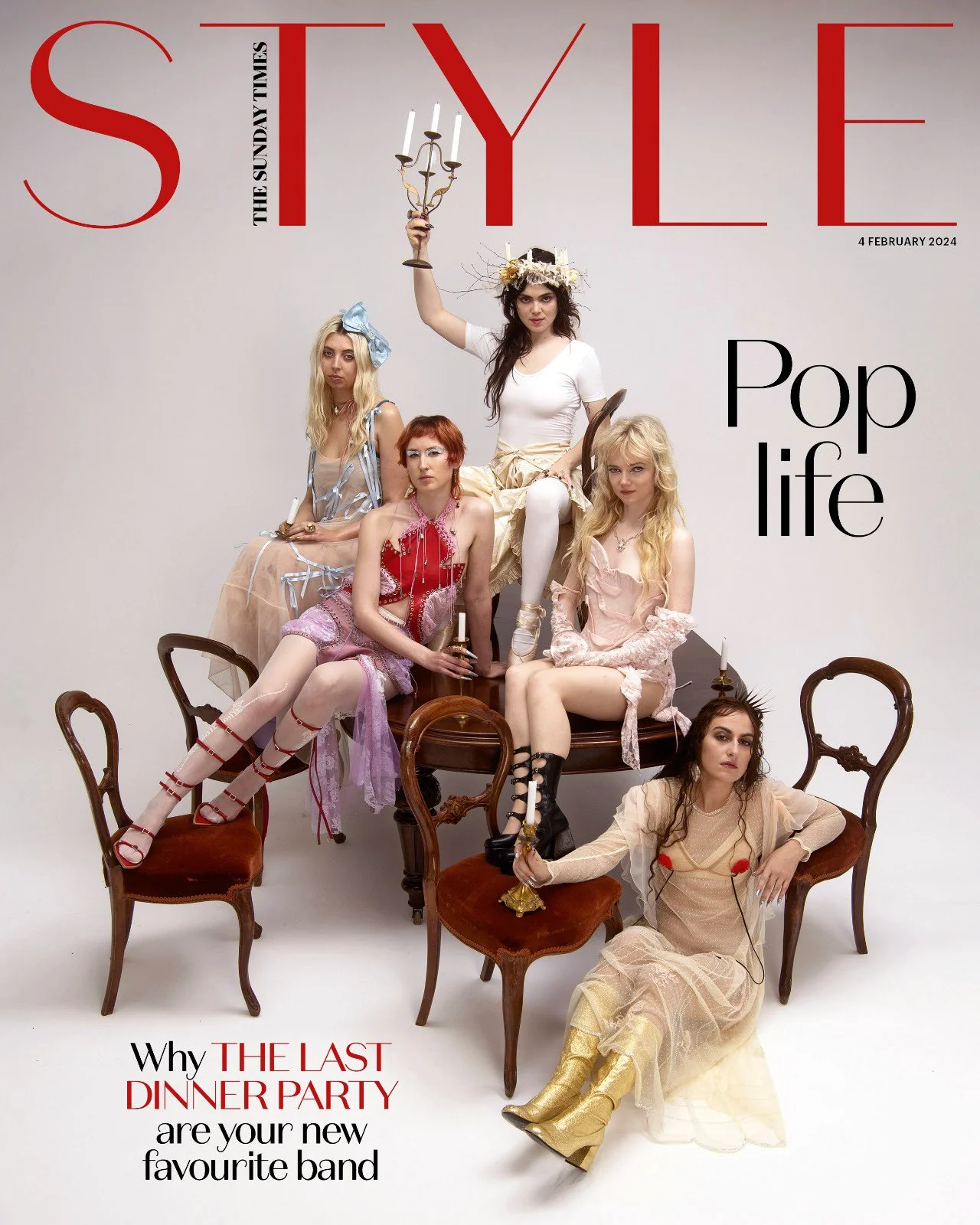
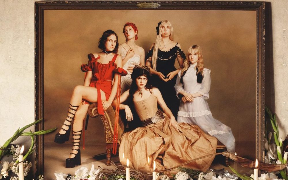
The Last Dinner Party – Prelude to Ecstasy
This group is one I discovered in Summer 2024 with their newest studio album “Prelude to Ecstasy”. Their branding is like if vintage styles, religious imagery, and a maximalist room had a baby. They use a mix of vibrant and muted color palettes in their art.
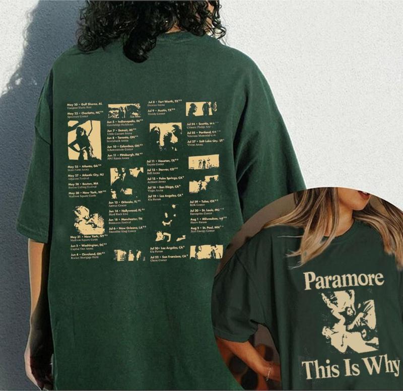
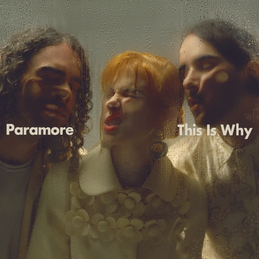
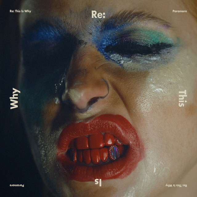
Paramore – This Is Why
Paramore has been one of my favorite bands since I was in 6th grade. With their 2023 studio album “This Is Why”, there’s a muted color palette with a sans serif typeface that is used minimally. I love the way the album cover is laid out with the words splitting up the frame. They obviously use a grid system in their design, which makes the covers appear structured.
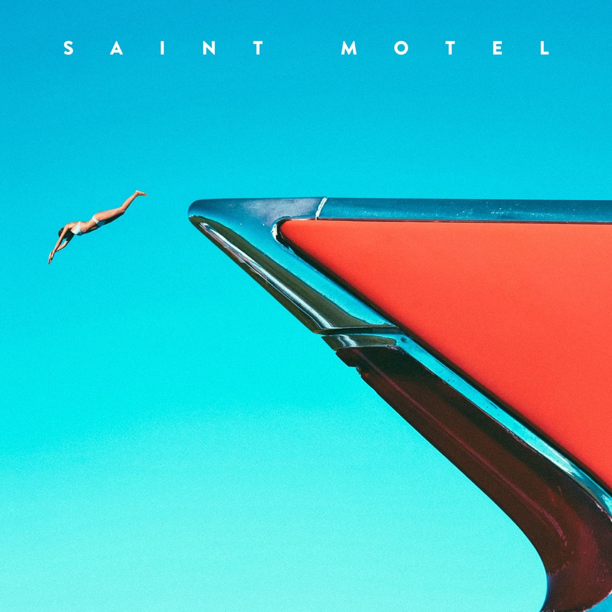
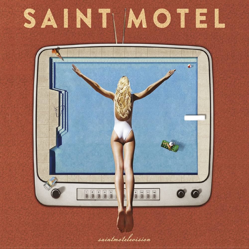
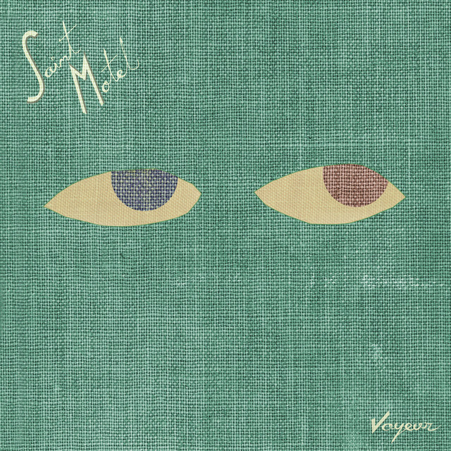
Saint Motel
Saint Motel’s color schemes are mainly reds, blues, and greens (RGB!) which are used in a really pleasing way. The human forms and textures that end up in their album covers, looking like a collage, are interesting to me. The albums also evoke a surrealist vibe, bending reality just enough to make it recognizable but dream-like.
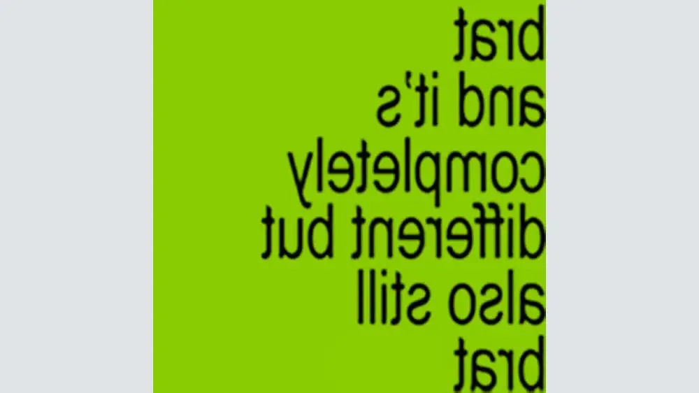
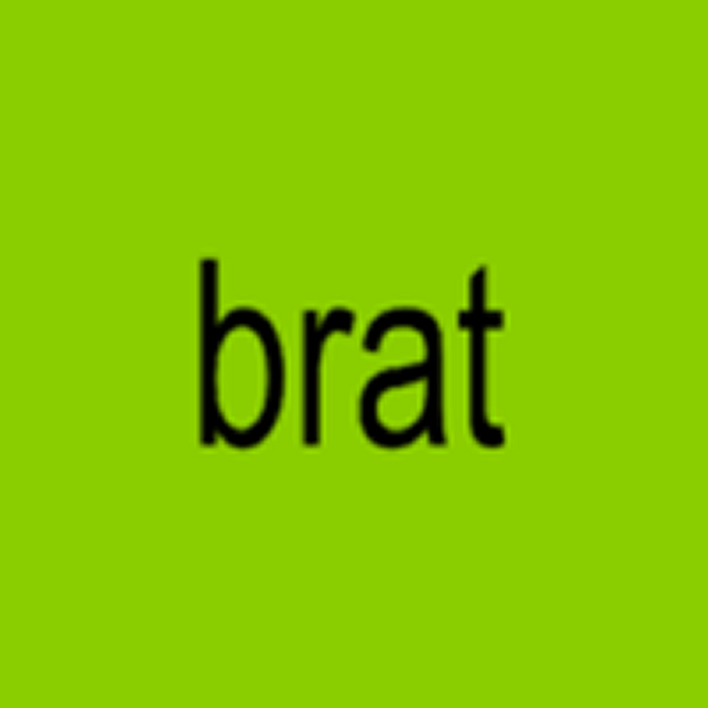
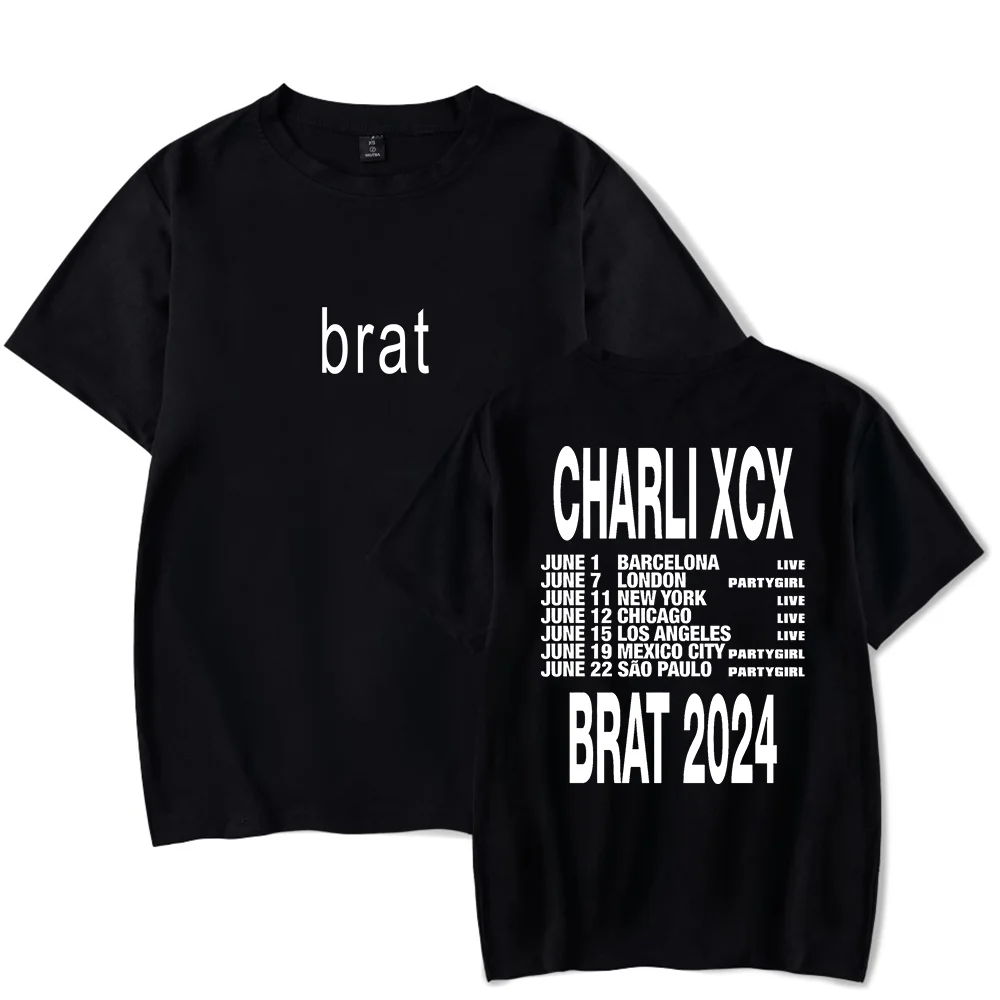
charli xcx – brat
This album design from artist charli xcx sold the minimalist look with just the word “brat” on a green background. This design is heavily typography-based, which I appreciate when done correctly. brat’s design had a grip on pop culture for good reason, as it rebelled against typical album art by being shockingly minimal. It’s edgy, in-your face, and effective at doing so!
Leave a Reply