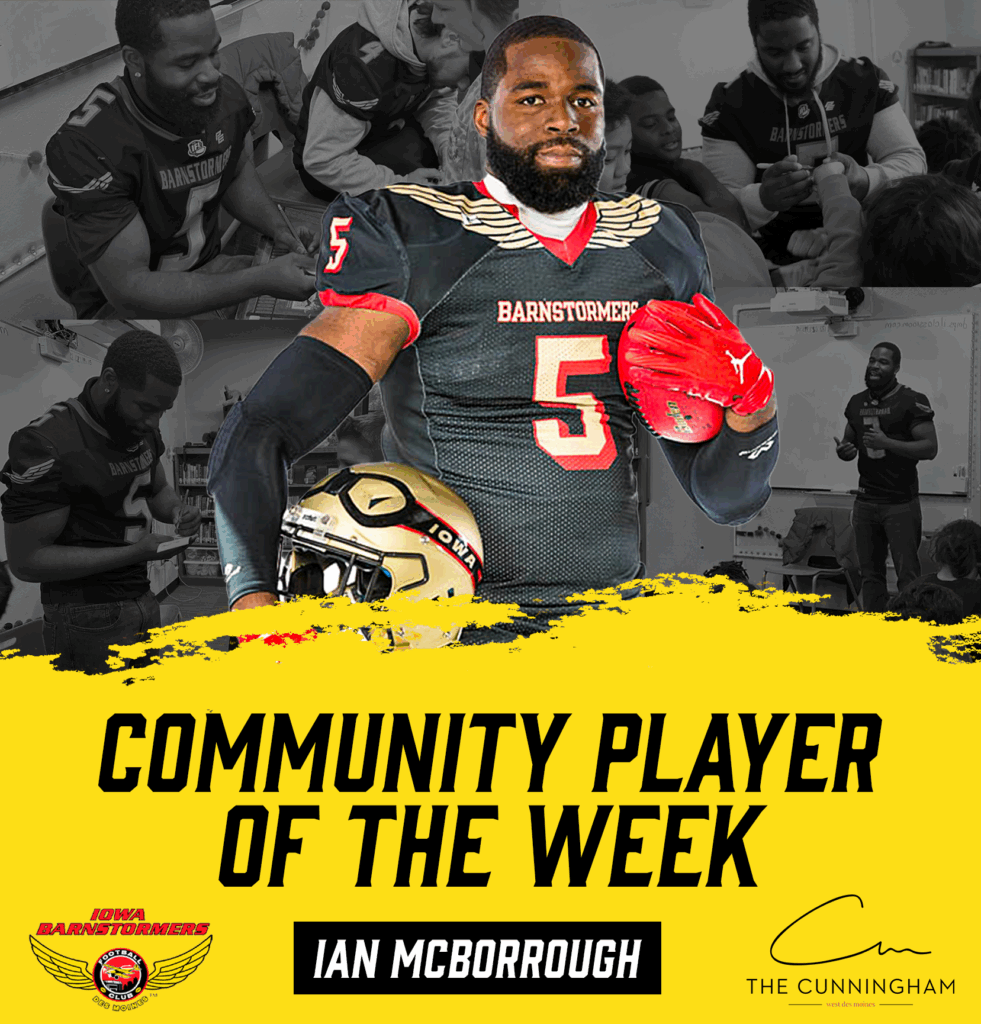
Designing for a professional sports team is a dream for many creatives, and I’ve been lucky enough to live that experience. But one thing I learned quickly, it’s not about what you want. It’s about what fits the brand.
When designing for the Iowa Barnstormers, I had to shift from creating what I thought looked cool to what represented the team. That meant letting go of specific bold ideas I might use for a personal project and instead focusing on consistency, tradition, and brand identity.
Every pro team has a visual identity—colors, fonts, logos, and tone. Straying too far from that can confuse. Even if a wild new design idea feels exciting, if it doesn’t fit the brand, it doesn’t belong. Learning to work within those rules was a huge step for me as a designer.
In your work, you can take creative risks and experiment. However, when designing for a team, the work must speak for the brand, not your style. I learned to pull back when needed and to prioritize clarity and consistency over flashiness.
Working with a team means talking and working with coaches, media staff, and sometimes players. You have to find a balance between making something that looks good and making sure it works for everyone. I realized listening to feedback and being flexible was as crucial as the design itself.
Designing for the Iowa Barnstormers taught me to be more disciplined and flexible. It helped me grow by showing me how to think beyond my style and create designs that fit a bigger picture. And honestly, having those limits made me a better designer. Good design isn’t just about looking cool it’s about sending the right message to the right people at the right time.

